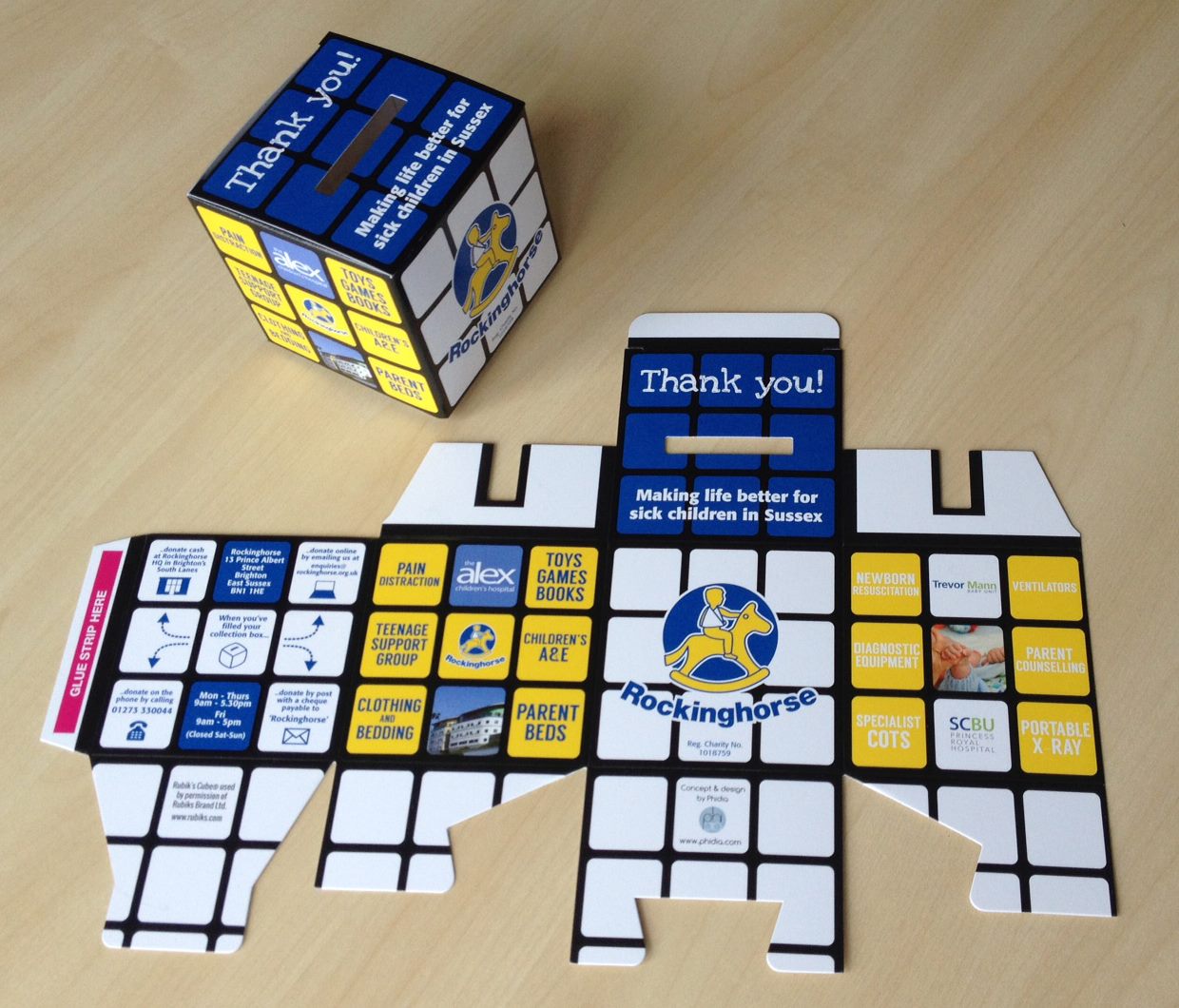
Rubik’s Cube Charity Box

Year

2014

Client

Rockinghorse

Project

Concept & Design for a Charity Collection Box

Tools

Adobe Illustrator

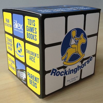
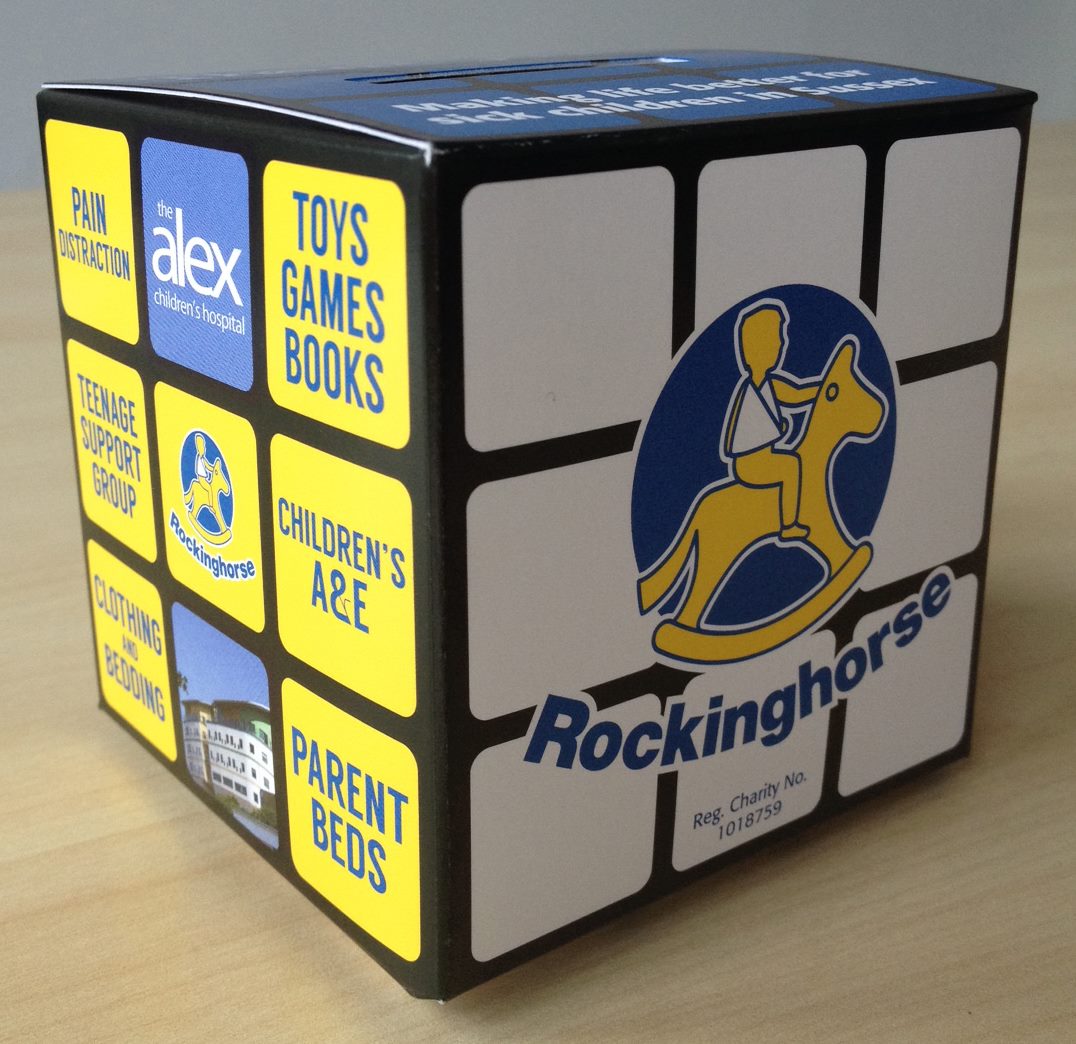
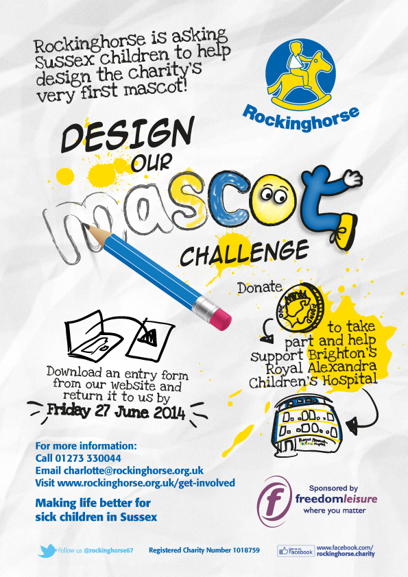
As well as medical equipment, Rockinghorse funds items such as toys and games to make children’s stay in hospital more fun.  The concept of a Rubik’s Cube, given official approval by the nice folk at Rubik’s, is a reference to this and helps the collection box to stand out.  The design also has a broad retro appeal which looks equally at home in schools, shops or trendy Brighton bars.


Rubik's_Cube_Collection_Box_2

Rubik's_Cube_Collection_Box_1

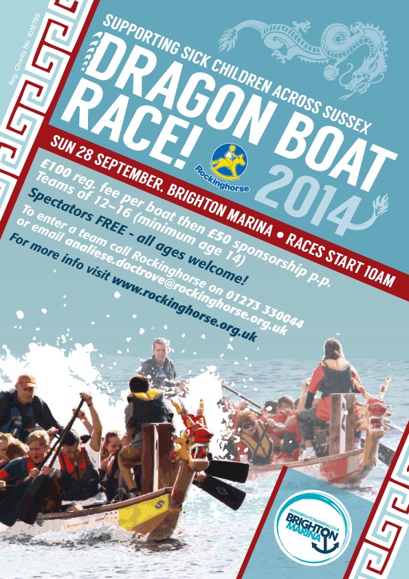
Dragon Boat Race

Year

2014

Client

Rockinghorse

Project

Design of an A6 postcard

Tools

Adobe Photoshop & Illustrator

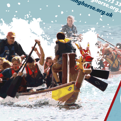
The main image was created by digitally cutting up a photo from last year’s event.


DragonWeb

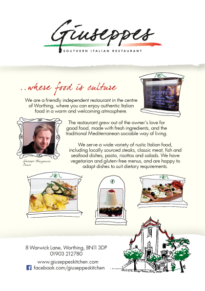
Giuseppes Flyer

Year

2014

Client

Giuseppes

Project

Illustration and design of a promotional flyer

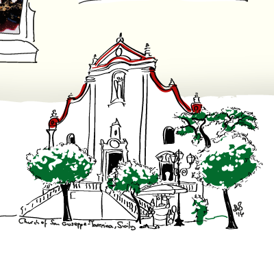
To promote this Sicilian restaurant in a local food festival (using house fonts & colours).


FoodFest_rgb

The Hypnosis Service

Year

2014

Client

The Hypnosis Service

Project

Logo design

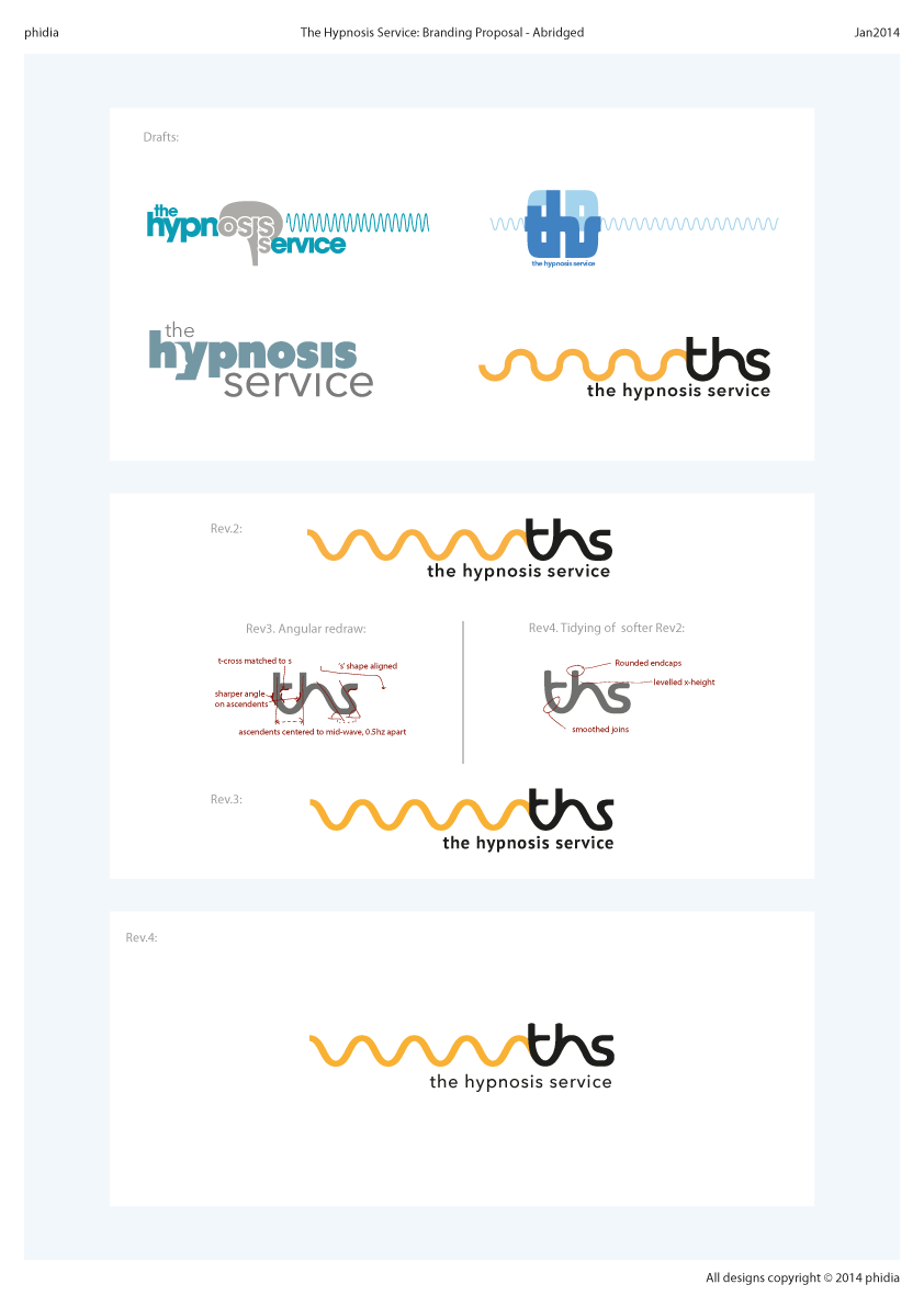
Abridged version of a logo proposal for a new company offering clinical hypnosis treatments.

HypnosisLogo

Hilton Ball

Year

2014

Client

Hilton in the Community Foundation

Project

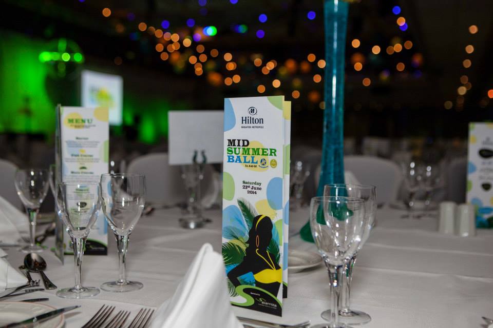
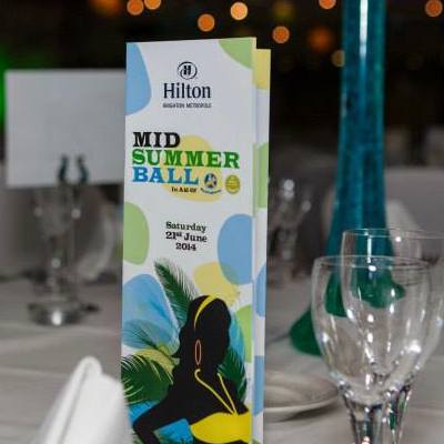
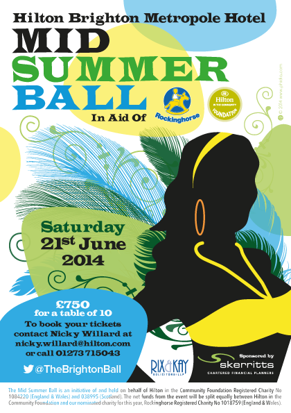
2014 Charity Ball Campaign: Flyer/ Poster, Email Signature, Vinyl Banner, 12pg Ball Programme, Slide Template

Tools

Adobe Illustrator, MS Powerpoint

The Hilton’s 2014 Ball theme was chosen to be ‘Carnival’ to coincide with the World Cup in Brazil.


 Poster:

2014_Ball_A5_RGB_best-for-web-email_2

Email signature:

2014_Ball_E-Sig_RGB

Programme:

BallTablesPhotograph © 2014 Chris Demott Photography  www.chrisdemottphotography.com

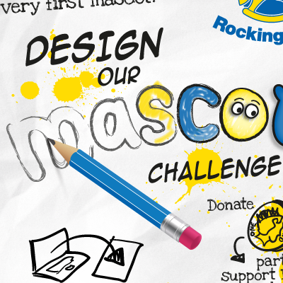
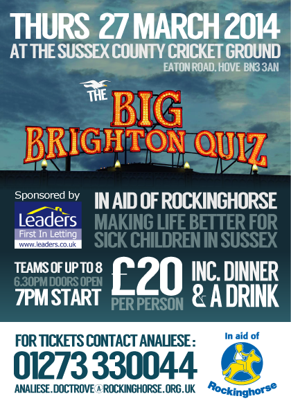
Big Brighton Quiz

Year

2014

Client

Rockinghorse

Project

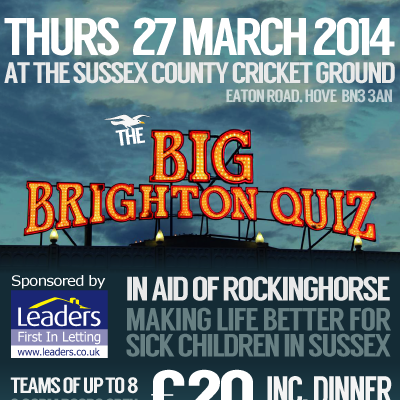
Design of an A5 printed flyer

The main image was created by manipulating a photo of the locally well-known Brighton Pier sign in Photoshop.


BigBrightonQuizWeb

Charity Golf Day

Year

2013

Client

Rockinghorse et al.

Project

Design and illustration of an A5 printed flyer

This design used variations of the ‘Neutra’ font, taking inspiration from posters of the 30s and 40s.  The green blobs are a tracing of the course map for the first hole at West Hove Golf Club.

Golf_Day

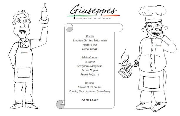
Giuseppes Juniors

Year

2013

Client

Liotru / Giuseppes

Project

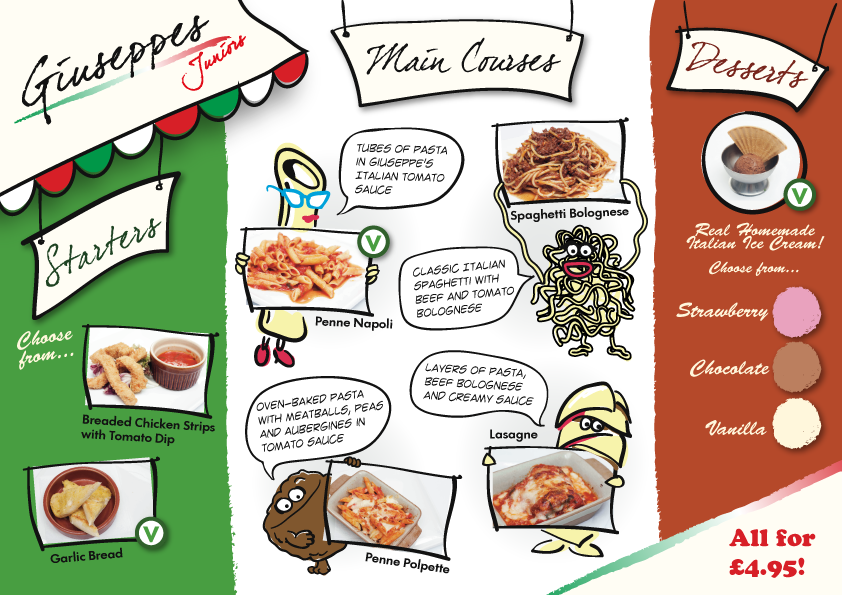
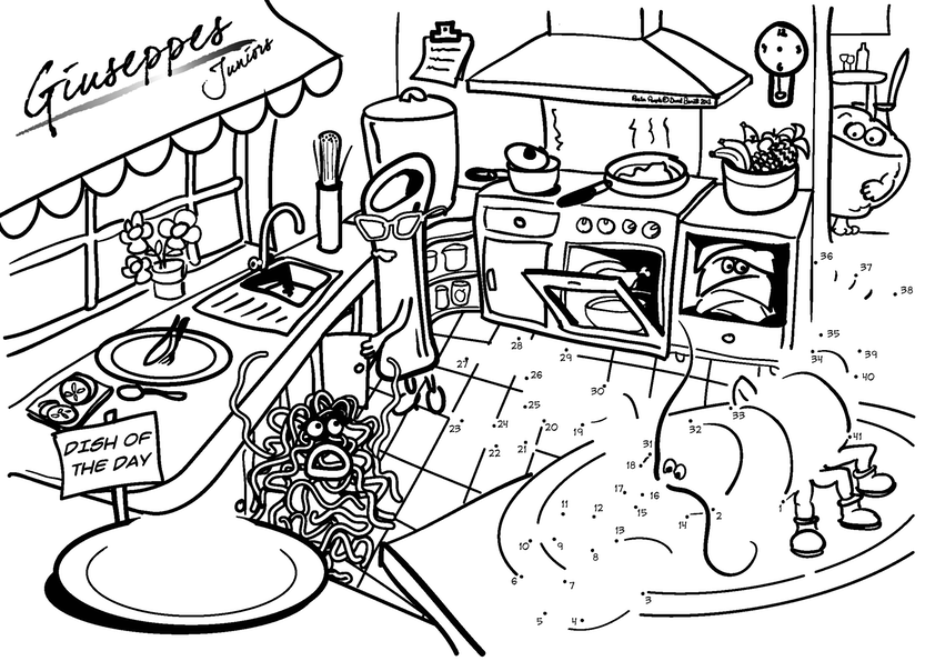
Design and illustration of a new Kids Menu and Colouring Sheet
This project included an open brief to design cartoon characters in place of two Italian chefs.  The ‘Pasta People’ retained a sense of Italian identity while avoiding old-fashioned stereotypes.

GiuseppesJuniors


GJrsColouringSheet


Previous menu: KidsMenuOldsmall